Posted on Leave a comment

Unity, Labor, Victory: The Visual Language of Soviet Industrial Art

This image is a powerful example of Soviet industrial-era poster art, where imagery was designed to communicate strength, solidarity, and momentum at a glance.

Across the composition, workers advance together—tools raised, faces forward, bodies aligned in motion. Wrenches, gears, and steel beams dominate the frame, transforming everyday instruments of labor into symbols of progress. The message is unmistakable: unity creates power.

The bold typography at the top reinforces this theme, pairing short, declarative phrases with high-contrast color. Red and black anchor the design, while angular shapes and overlapping figures create a sense of collective movement rather than individual identity.


Posters like this were never meant to be subtle. They were designed for factory walls, city streets, and public spaces—places where attention was brief and messages needed to be immediate.

Key visual elements include:

  • Repetition of figures to emphasize collectivity
  • Raised tools symbolizing labor as heroic
  • Industrial motifs—gears, steel, machinery
  • Strong diagonals suggesting motion and momentum
  • Limited color palette for clarity and impact

Every choice serves readability and emotional force. This is graphic design as communication, not decoration.


Posted on Leave a comment

Blueprint of Power: Type 42 Heavy Bomber Technical Drawing (1944)

There’s a quiet authority to an aircraft blueprint.

Stripped of camouflage, markings, and mythology, what remains is pure intent: form, scale, and function. This technical drawing of the Type 42 Heavy Bomber, produced in 1944, captures that moment where aviation was engineered not for elegance—but for range, payload, and endurance.

Rendered in classic blueprint style, the drawing presents the aircraft from three essential perspectives: side elevation, plan view, and front elevation. Together, they tell the complete story of the machine.


The numbers alone are revealing. A 102-foot wingspan, multi-engine configuration, and long fuselage designed to carry crews, fuel, and ordnance across vast distances. Every line serves a purpose:

  • Broad wings for lift and stability
  • Multiple engines for redundancy and power
  • A fuselage designed around crew stations and internal systems
  • Tail geometry optimized for control at altitude

This was aviation designed with slide rules, drafting tables, and field experience—not simulations.


Posted on Leave a comment

Forged in Steel and Symbolism: Soviet Reconstruction Poster Art

This image is a striking example of Soviet reconstruction-era poster art, a visual language built to communicate strength, unity, and relentless forward motion in the aftermath of war and industrial upheaval.

At the center stands the archetypal worker—hammer raised, body anchored, gaze fixed forward. He is not depicted as an individual, but as an embodiment of labor itself. Around him, factories rise, cranes swing into motion, gears turn, and silhouettes of fellow workers advance in unison. Every element reinforces a single idea: rebuilding through collective effort.

The bold red star, heavy angular forms, and limited color palette are deliberate. This is art designed for instant comprehension from a distance—meant to be read in seconds, not studied quietly. Soviet posters were mass communication tools, merging graphic design with ideology, engineered to motivate, instruct, and inspire.


During the reconstruction period, posters like this played a critical role. They weren’t decorative; they were instructional and symbolic. They framed labor as heroic, industry as noble, and rebuilding as a shared national mission.

Key visual themes include:

  • Heroic scale — workers depicted larger than life
  • Upward motion — diagonal lines, raised tools, forward stances
  • Industrial motifs — gears, cranes, smokestacks
  • Unity over individuality — figures act as a collective force
  • Red and black contrasts — urgency, power, resolve

This was propaganda in the purest historical sense: not subtle, not ironic, but visually commanding.


Posted on Leave a comment

Inside the Machine: Exploded Technical Diagram of an Early Industrial Engine

There’s a certain honesty in exploded technical drawings.

Nothing is hidden.
Every bolt, piston, ring, and shaft is laid bare — not for decoration, but for understanding.

This exploded diagram of an early industrial engine captures that philosophy perfectly. Rendered in the meticulous linework typical of late-19th and early-20th-century engineering drafts, the illustration breaks the machine down to its essential components, showing how power was created, transferred, and controlled long before computer modeling existed.

What you’re looking at is not just an engine — it’s problem-solving frozen in ink.


A Blueprint for the Mechanical Age

Before CAD software, before simulations and digital twins, engineers relied on drawings like this to communicate ideas with absolute precision. Each numbered component served a purpose:

  • Pistons and cylinders converting combustion into motion
  • Crankshafts and gears translating force into usable rotation
  • Valves, housings, and fasteners designed for durability and serviceability
  • Modular construction that allowed machines to be repaired, not replaced

These diagrams were instructional tools, manufacturing guides, and maintenance manuals all at once. They assumed the viewer wanted to understand the machine — not just operate it.


Posted on Leave a comment

The Birth of Power: Early Steam Turbine Technical Drawing from the Late 19th Century

Before electricity lit our cities and factories hummed through the night, the world ran on steam, steel, and ingenious engineering. This exploded technical diagram of an early steam turbine (No. 45, circa 1890) captures that moment in history — when human innovation was turning pressure and heat into rotational power, pushing industry into a new age.

This diagram isn’t just a picture.
It’s a mechanical anatomy lesson, a snapshot of invention.

Each numbered component reveals a piece of the machine’s story:

  • Gears, shafts, bearings, and turbines working in precise orchestration
  • Early mechanical coupling systems transferring force to rotation
  • A cooling flow and pressure system designed for maximum efficiency
  • Engineering designed first by pencil, not processor

In an era when heavy industry was built by hand and blueprint, drawings like this were the lifeblood of invention — technical roadmaps that allowed machinists, millwrights, and steam plant operators to replicate and maintain equipment that powered mills, ships, and power stations around the world.


Details

#propaganda #wall-art #posters

Posted on Leave a comment

Introducing Atelier Root Singapore – WWII & Pacific Theatre Posters for Southeast Asia

We’re excited to announce the launch of Atelier Root Singapore, a new regional storefront created for collectors, history enthusiasts, and interior art lovers across Singapore & Southeast Asia.

For the past months we’ve been restoring historic poster artwork from WWII archives — many relating directly to the Pacific Theatre, the Battle of Singapore (1942), Australian enlistment posters, naval operations in the Indian & Pacific oceans, and SEA wartime propaganda prints. Until now, most of our traffic and orders have come from North America and Europe — but we know there’s a vibrant audience in Southeast Asia who shares the same passion for historical art.

To better serve this region, we’ve launched:

A dedicated SEA storefront:

The Singapore version of the site will offer:

  • Localized product presentation for SEA
  • Faster delivery routing for surrounding regions
  • Content focused on Pacific & Singapore WWII history
  • The same archival-quality prints as our global store
  • A growing collection of SEA-relevant posters

As we expand, we’ll be adding more Singapore-specific content, including educational pieces, wartime art breakdowns, downloadable resources, and unique spotlight releases.


Why a dedicated SEA site?

Because history deserves context.

While many of our posters represent the global effort during WWII, the Pacific front carries a unique story — one that reshaped Singapore, Malaysia, the Philippines, Indonesia, and the region as a whole. Our goal is to make these historical pieces more accessible, locally relevant, and visible.

Whether you’re decorating a home, office, museum space, classroom, or simply collecting, we hope this brings the art closer to you.


Explore the new Singapore store

Visit: https://sg.atelierroot.art/
Save it, browse it, critique it — we’re just getting started.

If you’re based in Singapore, Malaysia, or Southeast Asia and would like to see a particular poster restored or sourced, feel free to reach out. We’d love to hear from you.

History isn’t static. It lives when we reprint it, frame it, and place it on a wall where someone can ask a question.

And that is everything we stand for.


If you enjoy our work, share the Singapore link with a fellow history enthusiast and help us bring these posters back into the world.

Posted on Leave a comment

“The M-1 Does My Talking… With Your Cartridges” – A Poster That Spoke Louder Than Words

Vintage WWII U.S. Army poster featuring a battle-worn soldier holding an M1 Garand rifle in one hand and ammunition clips in the other. Bold text reads “The M-1 does MY talking! …with your cartridges.”

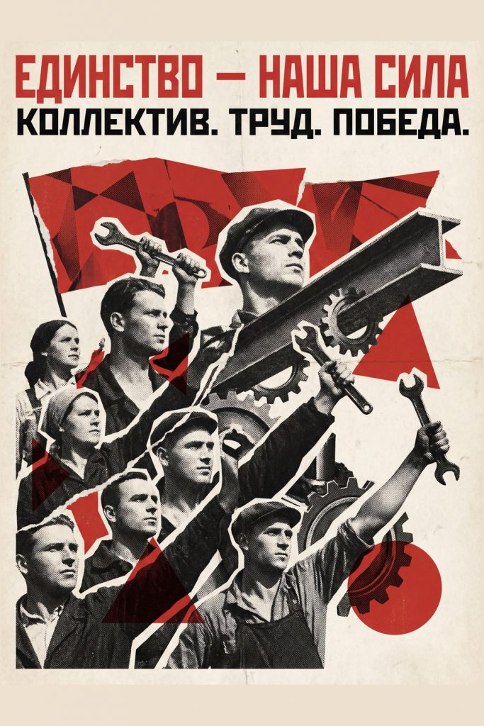
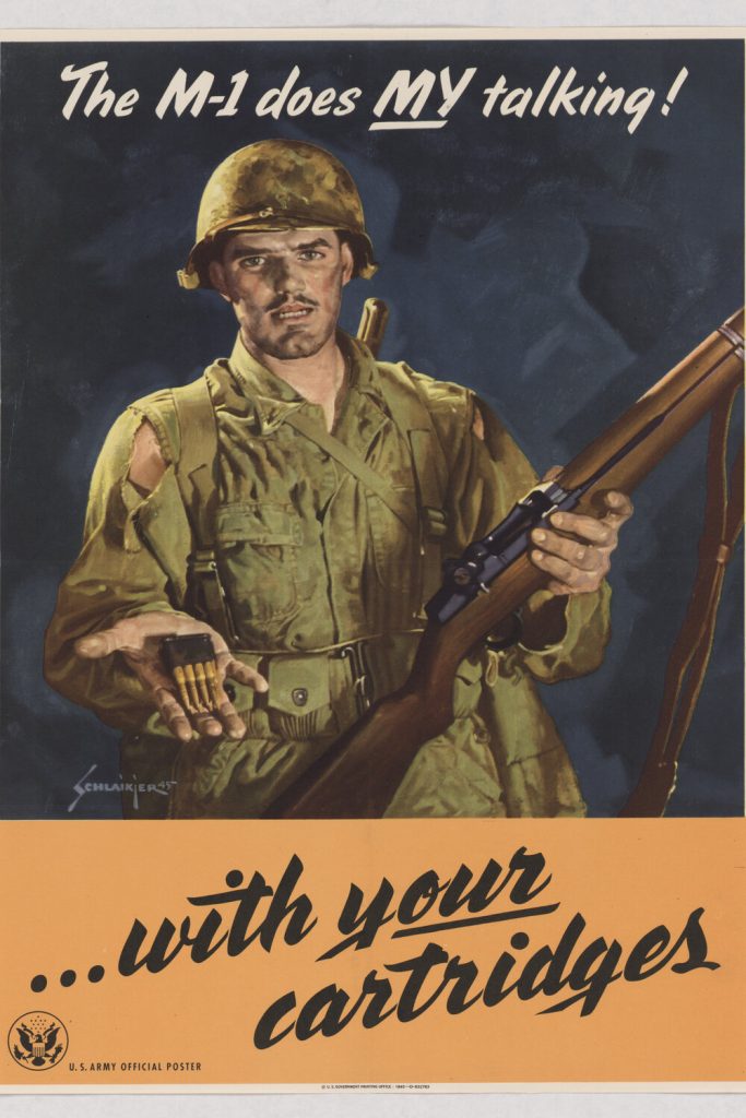
World War II posters didn’t whisper — they shouted. They were bold, direct, emotional, and persuasive. And few capture that raw urgency quite like this one.

Here we see a soldier front and center — uniform torn, face worn by combat, yet steady and unbroken. In one hand, he grips the legendary M1 Garand, the semi-automatic rifle that would become an icon of the American infantry. In the other, he holds out a clip of cartridges, as if offering a simple truth:

A soldier’s voice on the battlefield is ammunition.

Across the top, the poster delivers its punchline in confident script:
“The M-1 does MY talking!”
And just beneath, the follow-through:
“…with your cartridges.”

This was propaganda with teeth — not just inspiration, but a reminder. Behind every Marine, every infantryman, every front-line push, there was a civilian back home responsible for keeping ammunition flowing. Production, rationing, war bonds — it all tied together.

The Weapon That Defined the American Soldier

The M1 Garand changed warfare. Faster firing than traditional bolt-action rifles, it gave U.S. troops a critical edge. General George Patton famously called it “the greatest battle implement ever devised.” Posters like this helped cement that reputation, turning the rifle into a symbol of American grit.

The visual detail reinforces that message — torn sleeves, dirt on the skin, the weight of combat etched into the soldier’s eyes. There’s no glamour here. No romanticized battlefield. Just a man who needs ammunition to survive another day.

This wasn’t about glory. It was about support.

A Call to Action on the Homefront

While the front line fought overseas, the homefront had its own war to win. Posters like this targeted factory workers, shipyard welders, and everyday Americans to ramp up production and buy war bonds. Every bullet mattered. Every crate mattered. Every shift mattered.

The government didn’t say “help the war effort.”
It said “he needs you.”

And that personal connection worked.

A Powerful Piece for Collectors and History Enthusiasts

Framed on a wall, this poster is more than décor — it’s a window into 1940s America. It tells the story of:

  • sacrifice and exhaustion on the battlefield
  • industrial might and unity at home
  • the symbolism of the M1 rifle
  • how art fueled a nation at war

For enthusiasts of WWII history, military imagery, or propaganda art, this piece stands tall as a reminder that wars aren’t won by soldiers alone — but by everyone who keeps the supply line alive.

When the M-1 Speaks, It Speaks Loud

This poster isn’t subtle — and it wasn’t meant to be. It’s a gritty handshake between soldier and citizen. A reminder that behind every victory was a bullet, and behind every bullet was a worker, a factory, a sacrifice.

The M-1 may have done the talking —
but America answered with cartridges.

Posted on Leave a comment

Be a Marine – Free a Marine to Fight: Women on the Homefront Step Forward

Vintage World War II U.S. Marine Corps Women’s Reserve recruitment poster featuring a woman in Marine uniform in the foreground, with male Marines in combat behind her. Text reads “BE A MARINE… Free a Marine to fight – U.S. Marine Corps Women’s Reserve

During World War II, victory required more than front-line heroism — it required an entire nation mobilized with purpose. Factories roared to life, farms fed millions, and for the first time on such a scale, women were invited to take their place in the U.S. Marine Corps.

This poster, boldly titled “Be a Marine… Free a Marine to Fight,” is one of the most recognizable recruitment messages from the wartime homefront. Instead of depicting battlefields or weaponry, the central figure here is a woman — poised, confident, and wearing the proud uniform of the U.S. Marine Corps Women’s Reserve. Her expression is steady, almost resolute, projecting both dignity and responsibility. Behind her, Marines advance in combat, rifles raised, pushing forward toward the front line.

The message is clear: her service gives them the chance to fight.

A Pivotal Shift in American Military History

The Women’s Reserve was established in 1943 to fill non-combat roles so that trained male Marines could be sent overseas. These women served as mechanics, drivers, communication specialists, administrators — and even in technical fields that had previously been closed to them. They weren’t just supporting the war effort — they were reshaping what it meant to serve.

This poster captures that moment in time when barriers began to crack. The uniform, once exclusively symbolic of male combat, becomes shared. The call wasn’t framed as charity or necessity — but as duty.

Propaganda With Purpose

Wartime posters simplified big ideas into memorable images. With one glance, a passerby understood:

Join the Women’s Reserve → A Marine goes to the front → The nation grows stronger.

It’s recruitment as storytelling.

The background, painted in dramatic earth tones, shows troops moving under fire — a stark contrast to the calm and collected woman in the foreground. It suggests two worlds connected by commitment. She stands ready so that they may advance.

Why Collect Pieces Like This?

Posters like these are more than paper — they’re artifacts of a cultural shift. They tell us:

  • How America communicated urgency
  • How women stepped into new roles
  • How national identity was shaped through design and visual rhetoric
  • How art can motivate millions

In a modern setting — framed on a wall, office, classroom, or history room — this piece becomes a conversation starter. It sparks questions about gender, service, equality, and patriotism. It reminds us that war wasn’t won by soldiers alone — it was won by the people.

A Poster With Backbone

This isn’t just recruiting — it’s empowerment.
It marks a chapter where women’s service was not asked quietly, but called for boldly.

When we look at it today, we see more than an invitation.
We see recognition, sacrifice, and the beginning of change.


Posted on Leave a comment

¡Unidos Venceremos! – The Power of Unity in Work and War

Spanish Civil War propaganda poster showing a soldier and a worker standing side by side, looking determinedly toward the horizon. The soldier holds a rifle while the worker grips a sledgehammer. Industrial factories and rising smoke appear in the background, with bold text at the bottom reading “¡UNIDOS VENCEREMOS! TRABAJO Y LUCHA POR LA LIBERTAD.

In the 1930s and 40s, posters weren’t just decoration — they were rallying cries. They hung on factory walls, train stations, and city streets. They weren’t meant to be glanced at — they were designed to stir something. This poster, reading “¡UNIDOS VENCEREMOS! – TRABAJO Y LUCHA POR LA LIBERTAD” (“United We Will Win! Work and Fight for Freedom”), is a perfect example of that era’s spirit and art direction.

Here, two figures stand shoulder to shoulder:
A soldier with a rifle slung confidently in hand, and a worker gripping a hammer like a banner of industry. One defends the homeland, the other fuels it. War and labor — two fronts of the same struggle.

This style was common in anti-fascist propaganda during the Spanish Civil War and later echoed in WWII posters around the world. The message was universal: victory depends on everyone doing their part. Not just soldiers in trenches, but laborers in factories, farmers in fields, and families holding communities together.

Look closely and you get the feeling the artist wanted to freeze a moment of resolve — no chaos, no battlefield, just determination. The rays behind them radiate like a sunrise, hinting at hope. The factories below emit smoke, not pollution, but progress. It’s propaganda, yes — but it’s also optimism.

Why Posters Like This Matter Today

Posters from this era remind us how art shaped public morale. Governments didn’t just need guns — they needed belief. They needed citizens to feel that work had purpose. When people saw images like this, it wasn’t just ink on paper. It said:

You matter. Whether you carry a rifle or carry a hammer — you’re part of the fight.

In a modern world drowning in digital noise, pieces like this feel almost refreshing. Bold lines. Simple messaging. No algorithm. Just raw emotion and a call to stand together.

A Powerful Decorative Piece

In a home office, studio, library, or even a workshop, this poster sparks conversation. It’s not just vintage war art — it’s a window into a time when creativity and struggle were intertwined. For history lovers, artists, educators, or collectors, it stands as a reminder that unity can move mountains.

A piece like this earns its place on a wall.

Strong. Stoic. Purpose-driven.

Unidos, venceremos.
Still a powerful idea today.

Posted on Leave a comment

Bread and Belief: The Visual Strategy of the ‘Auxilio Social’

Spanish Civil War Nationalist propaganda poster by Salinas featuring a woman in an apron carrying large loaves of bread. A convoy of 'Auxilio Social' trucks travels a yellow road toward a burning city. Text reads '¡Ha entrado la España de FRANCO!'. Vintage Falange Nationalist wall art by Atelier Root

In the visual history of the Spanish Civil War, few images are as haunting or as structurally complex as the Auxilio Social (Social Aid) posters. While the Republican side often focused on the collective struggle of the militia, the Nationalist propaganda under Francisco Franco frequently leaned into themes of order, reconstruction, and the “benevolent” restoration of traditional life.

The Symbolism of the Bread

In this striking 1930s reproduction, the artist Salinas uses a motherly figure to anchor the composition. Clad in a simple apron and carrying a mountain of large loaves, she represents more than just food; she represents the promise of stability after the scorched-earth chaos depicted in the background.

Notice the yellow road winding away from the burning city—it’s a path of “deliverance” traveled by the Auxilio Social relief trucks. The message was clear to a war-torn population: Where the España de Franco enters, the hunger ends.

The Artist: Salinas and the Falange Style

The illustrator Salinas was a master of the “Social Realist” style adopted by the Falange (Spain’s fascist party). Look closely at the bottom left, and you will see the Yoke and Arrows (Yugo y Flechas), the ancient symbol of the Spanish Catholic Monarchs adopted by Franco’s movement.

The aesthetic is clean, modernist, and highly effective:

  • The High-Contrast Glow: The woman is bathed in a halo of light, contrasting with the dark smoke of the ruins.
  • The Movement: The sweeping S-curve of the road draws the eye from the tragedy of the past (burning buildings) to the “abundance” of the present.
  • The Typography: The script is fluid yet authoritative, designed to feel like a definitive announcement.

Why It’s a Collector’s Essential

For historians and collectors of 20th-century political art, the “Franco’s Spain” posters are vital for understanding the war of images that defined the 1930s. This piece doesn’t just show a political shift; it shows how a movement attempted to win “hearts and minds” through the promise of basic necessities.

Whether displayed as a study in mid-century graphic design or as a somber reminder of a divided Europe, this print remains one of the most visually arresting examples of the Nationalist aesthetic.